Chaney Family Dentistry
Chaney family dentistry is a father-and-son dental practice in Vallejo, California. In early 2021 I developed a fully refreshed brand for them including a new logo, palette, tagline, and a set of illustrations, staff portraits, and sourced photography. These changes became part of their new website. I also designed a suite of physical assets including stationary, business cards, and appointment cards.
The brand, before-and-after
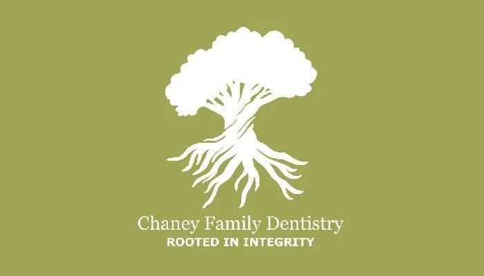
The family name Chaney means “Oak”, and an oak tree featured prominently in the Chaney Family Dentistry’s previous brand. For the refresh they wanted to keep the oak theme, but make it cleaner, more elegant, and more related to dentistry. In my discussions with Alex Chaney what came across as the differentiator between their practice and other dental offices is ethics: they are firm about only recommending procedures that are truly needed. From that I came up with the tagline “rooted in integrity”, and a tree that is half above-ground and half roots. The image of the roots also subtly nods to the roots of a tooth.
Original Brand:

Refreshed Brand:


Warm, calm colors
The colors of the brand are meant to evoke the feelings of walking through an oak grove: trust, calm, warmth, and steadiness.

A small business perk: custom portraits
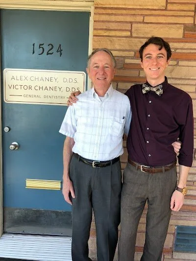
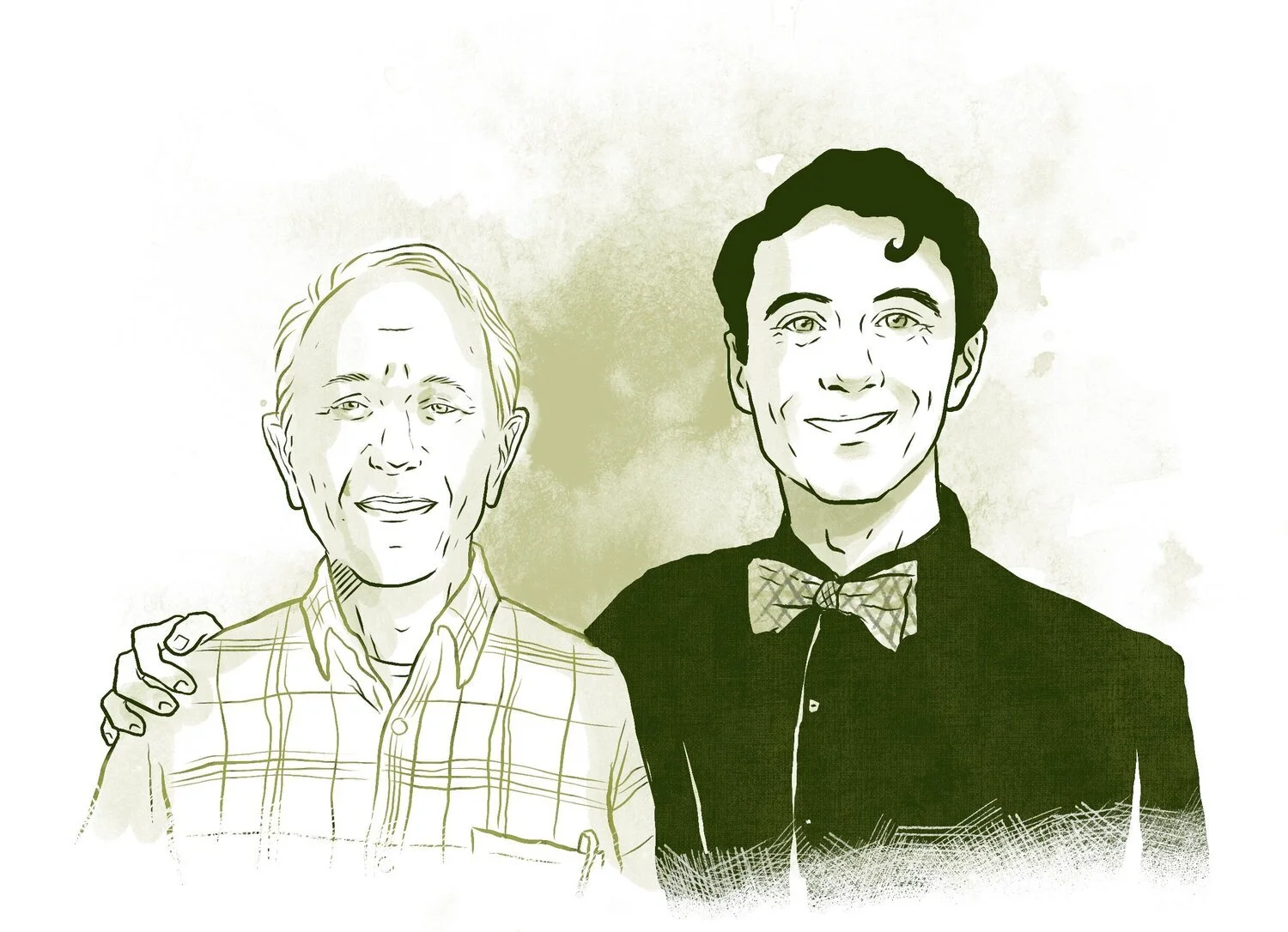
The previous iteration of the site had photos taken of the dentists and staff with varied lighting and backgrounds. Because this is a smaller practice with just the father and son dentists and a few trusted staff, I added a personal touch by creating portraits.


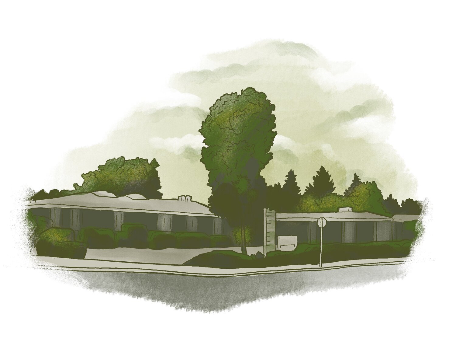
The hand-drawn difference
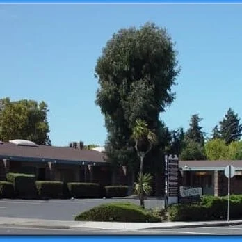
I also replaced a photograph of the office with a drawing, that is just as informative but more welcoming. I also created a hero-image of the father and son team.
Stock Photography


Print materials
In addition to web design, I also designed assorted print materials for Chaney Family Dentistry, as shown below:
Business cards

Business card front
Business card back
Appointment cards
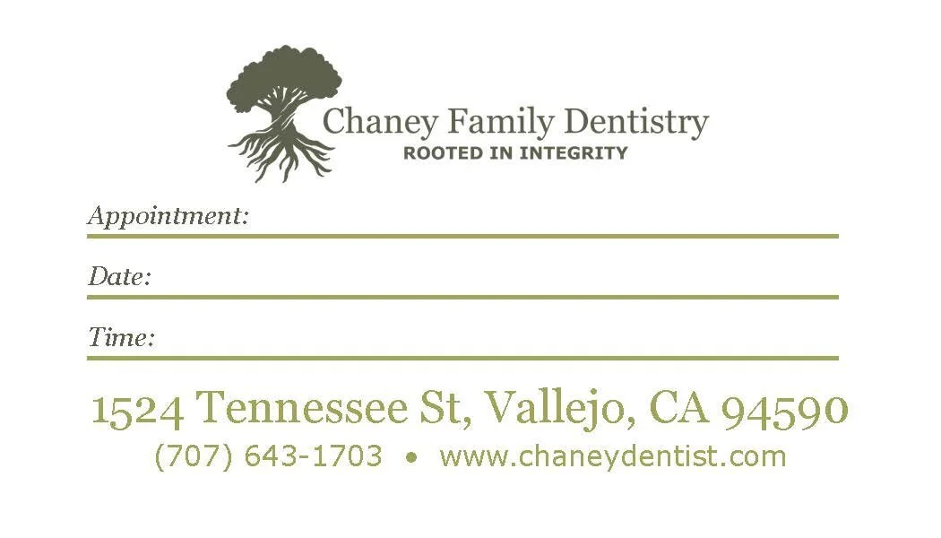
Appointment card front

Appointment card back
Testimonial from Dr. Alex Chaney:
“Elizabeth did a fantastic job with our website and overall re-branding. I had a lot of older office materials like appointment cards and handouts, but it all looked like it came from different places, and our website didn’t seem to have much of a coherent theme or look. Elizabeth was really helpful in picking out a color theme and making sure to check in at every step along the way. Now everything looks much more coherent and simplified. We’ve since had several very positive comments about our new website and materials. Elizabeth was easy to work with, detailed, and timely. I would highly recommend her for any graphic work.”